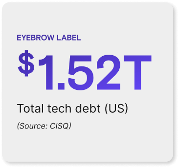
Website Modules
Built for Consistency & Flexibility
Each website module follows the latest brand guidelines to ensure a unified, scalable, and user-friendly digital experience
Cards
Card Style Guidelines
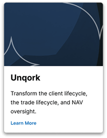
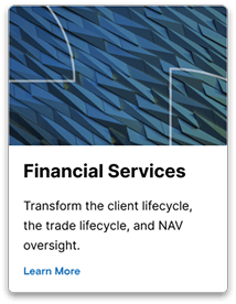
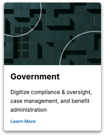
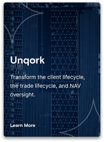
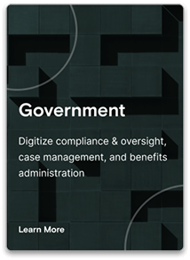
These cards serve as a visual framework for the Unqork brand, adaptable for various industries. Maintaining consistency is paramount, ensuring a unified brand experience across all card styles. This includes adhering to the defined typography, color palettes, and spacing guidelines. While maintaining brand consistency, it’s crucial to tailor card styles to resonate with specific industries. Employing industry-appropriate imagery and color schemes creates a sense of familiarity and relevance for the target audience.
Key Considerations
Clear and concise messaging within the cards is essential, with text limited to essential information and strong calls to action to encourage user engagement. A clear visual hierarchy is necessary to guide user attention, utilizing bolding, font size variations, and spacing to emphasize key information and create a sense of order. Accessibility is paramount, ensuring all card styles are accessible to users with disabilities through sufficient color contrast, alternative text for images, and consideration for keyboard navigation. Responsive design is crucial, with cards adapting seamlessly across different screen sizes and devices. While maintaining these guidelines, flexibility and adaptability are essential to accommodate evolving brand needs and creative expression.
Standard Cards
Unqork
Financial
Insurance

Healthcare

Government
Full Background Image Card


Featured Images


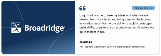
Pull Quotes
On a Light Background
Large
Small

On a Dark Background
Large
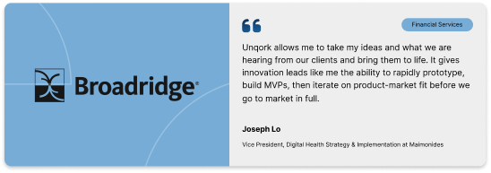
Small

Statistics
On a Light Background

On a Dark Background
