BRAND IDENTITY
One identity for the AI-first enterprise.
The Unqork and UnqorkAI logos represent a platform built for speed, control, and long-term confidence. Use each mark consistently to strengthen recognition and ensure every touchpoint feels unmistakably Unqork.
The Unqork Corporate Logo
Use the Unqork corporate logo when communicating about the company, our people, our culture, our partnerships, or Unqork as an organization.
Typical applications include:
- Corporate communications
- Careers and recruiting
- Employee initiatives
- Legal and administrative materials
- Company announcements
- Corporate sponsorships
- Communications covering multiple Unqork products or offerings
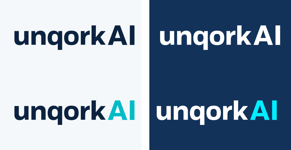
The UnqorkAI Product Logo
Representing our AI-first development platform.
Use the UnqorkAI logo when the primary subject is the product, platform experience, product capabilities, customer outcomes, or the future of enterprise application development.
Typical applications include:
- Product marketing
- Platform demonstrations
- Sales presentations
- Product announcements
- UnqorkAI campaigns
- Event experiences
- Partner solutions built on UnqorkAI
- Product documentation and training
Naming and Editorial Usage
When writing the Company and Product name although the wordmark has been stylized to showcase a lowercase letter u, the written form of Unqork should always be capitalized in headlines, body copy, presentations, or digital communications:


Clear Space
The minimum clear space is equal to the height or width of the lowercase “u” in Unqork.

Color Usage
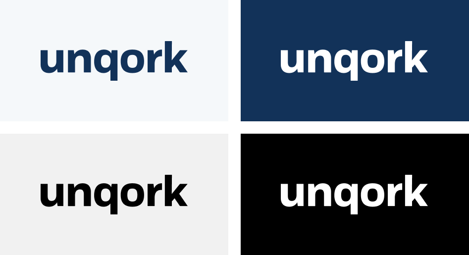
Always maintain our wordmark’s visual impact by reproducing it in a high-contrast manner.
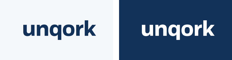
The Unqork wordmark should be colored Blue 500 (Hex #0C2340) on light backgrounds and white on dark backgrounds.When using the white wordmark, the default background should be Blue 500.
The black version of the wordmark should only be used when the application does not allow color.
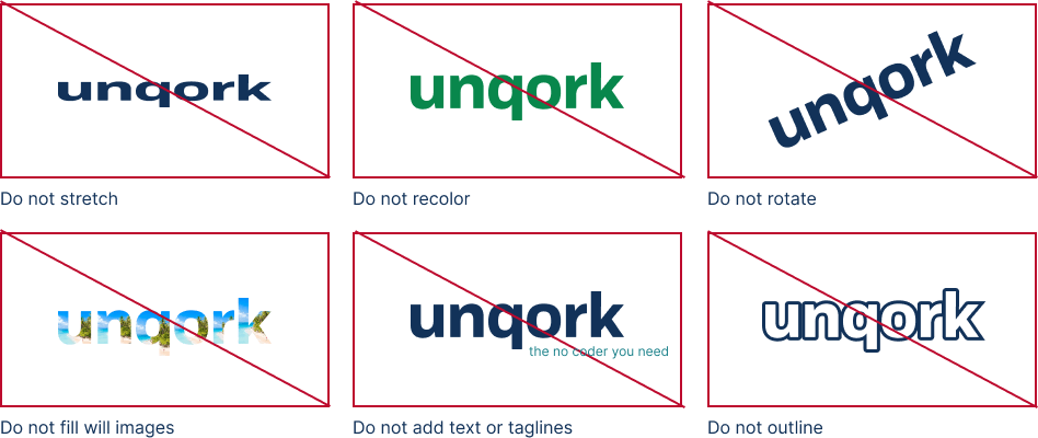
Misuse
Consistent presentation is an important part of making our logo recognizable.The following examples highlight a few improper uses.
Lockup
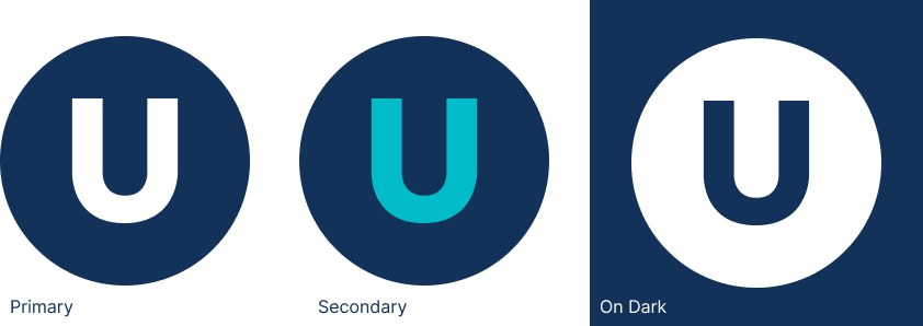
Our logo can be paired with the tagline or The U to complete the brand lockup.
Clear Space
Pair the logos horizontally with appropriate clear spacing and a 1px line in Gray 500 between each logo.The gray line should be equal to the length from the q descender to the k ascender.
Proportional Size
Optically, both our logo and the partner logo should have equal weight.
Visually determine the size relationship that feels appropriate based on the shape and structure of the partner logo.

Co-Branding
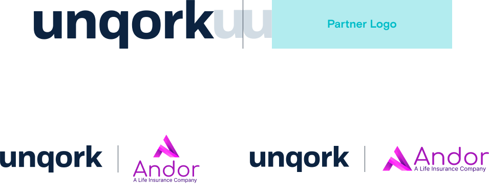
Our logo can be paired with a partner logo for co-branding.
Clear Space
Pair the logos horizontally with appropriate clear spacing and a 1px line in Gray 500 between each logo.The gray line should be equal to the length from the q descender to the k ascender.
Proportional Size
Optically, both our logo and the partner logo should have equal weight.
Visually determine the size relationship that feels appropriate based on the shape and structure of the partner logo.