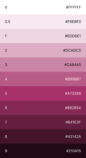
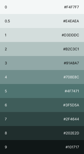
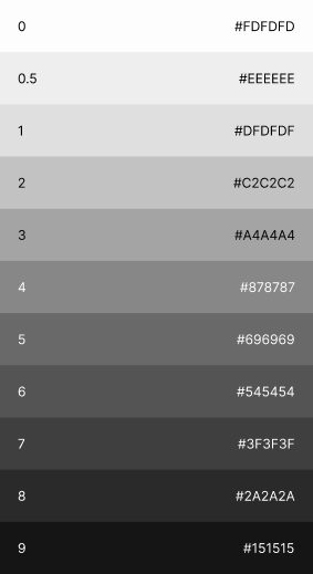
Unqork Color Palette
Harnessing the Power of Color
Discover the best practices for applying Unqork’s color palette, including the contexts and combinations that enhance brand visibility, consistency, and emotional impact across various media and design projects.
Primary Palette
Our primary palette directly reflects the premium quality of our product.Our gem/jewel tones convey a mystique that’s both sophisticated and energetic.

Blue
#0C2340
Pantone 2768

Aqua
#00BCC8
Pantone 3115

Royal
#1C75BC
Pantone 3005

Regal
#402CA5
Pantone Violet

Rose
#A73269
Pantone 7433
Secondary Palette
Our full color palette can be used in conjunction with the primary palette to expand the Unqork brand for more specific designs and product applications.
These colors should not be used independently or without including colors from the primary palette. They are also appropriate for functional uses such as error messages, announcements or other product elements.

Navy
#123259
Pantone 534

Lavender
#8E78FF
Pantone 2715

Pink
#D87CA7
Pantone 507

Sage
#5795A6
Pantone 7696
Neutral Palette
A collection of neutral warm greys helps to extend the palette and allows for added flexibility with both product and brand application.

Grey 50
#EEEEEE
Pantone 663

Grey 200
#C3C3C3
Pantone 428

Grey 400
#878787
Pantone Cool Grey 8

Grey 500
#696969
Pantone Cool Grey 10

Grey 600
#545454
Pantone Cool Grey 11

Grey 800
#2A2A2A
Pantone Black

White
#FFFFFF

Black
#000000
Gradients
Your gradient design colors should instead be uniquely tailored to the emotive and actionable reaction you are trying to evoke from your target audience.
These gradients will be use with in hero backgrounds and ‘Qorks’ and should be at a 45º angle Dark to light

#123259 to #1C75BC

#00bcc8 to #00F0FF

#402CA5 to #6648FF

#A73269 to #FF489E

#1C75BC to #46ADFF
Industry Specific
For 2025 we are going to be giving our industry specific work it’s own place at the table, each of these new color designations will be used on website, presentations and advertising to set a tone for Unqork in all of thee spaces
Financial

#77ACD7
Pantone 542
Insurance

#8B7FC9
Pantone 7746
Healthcare

#CA84A5
Pantone 687
Government

#5795A6
Pantone 7696

#123259 to
#77ACD7

#123259 to
#8B7FC9

#123259 to
#CA84A5

#123259 to
#5795A6
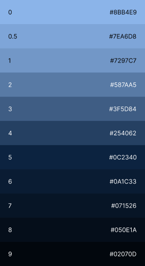
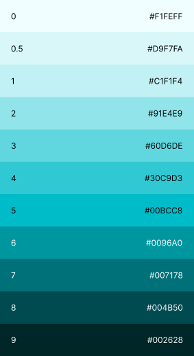
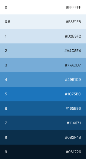
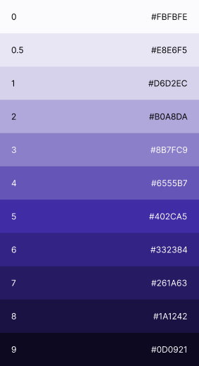
Color Shades
Our primary colors have been carefully designed with a range of complementary shades to provide flexibility across different applications. These shades allow for depth, contrast, and visual hierarchy, ensuring clarity and accessibility in both light and dark mode designs.
By using tints for highlights and accents, and deeper tones for emphasis, our color system maintains a cohesive and modern aesthetic across all brand touchpoints.
